
When I go to the Netherlands I feel small next to men from that country, but then I am 3 inches smaller than the average Brit, and the average Dutchman is 2 inches taller than the average Brit. So I am seeing 5 inches of height difference in the crowd around me when surrounded by Dutch men. No wonder I am feeling an effect that is much greater than what the average difference in height seems to be telling me on paper.
Averages are important. They help us determine if there is a real effect overall. Yes, men from the Netherlands are taller than men from Britain, and so my impressions are not merely anecdotal. They are real, and backed up by data.
If we are wanting to know if there are changes occurring, averages help too, as they ensure we are not focusing on outliers, but on a statistically significant trend. That’s not to say that it is always easy to handle the data correctly or to separate different factors, but once this hard work is done, the science and statistics together can lead us to knowing important things, with confidence.
For example, we know that smoking causes lung cancer and that adding carbon dioxide into the atmosphere leads to increased global warming.
But, you might say, correlation doesn’t prove causation! Stated boldly like that, no it doesn’t. Work is required to establish the link.
Interestingly, we knew the fundamental physics of why carbon dioxide (CO2) is a causative agent for warming our atmosphere – not merely correlated – since as early as Tyndall’s experiments which he started in 1859, but certainly no later than 1967, when Manabe & Wetherald’s seminal paper resolved some residual physics questions related to possible saturation of the infra-red absorption in the atmosphere and the co-related effect of water vapour. That’s almost 110 years of probing, questioning and checking. Not exactly a tendency on the part of scientists to rush to judgment! And in terms of the correlation being actually observed in our atmosphere, it was Guy Callendar in 1938 who first published a paper showing rising surface temperature linked to rising levels of CO2.
Whereas, in the case of lung cancer and cigarettes correlation came first, not fundamental science. It required innovations in statistical methods to prove that it was not merely correlation but was indeed causation, even while the fundamental biological mechanisms were barely understood.
In any case, the science and statistics are always mutually supportive.
Average Global Warming
In the discussions on global warming, I have been struck over the few years that I have been engaging with the subject how much air time is given to the rise in atmospheric temperature, averaged for the whole of the Earth’s surface, or GMST as the experts call it (Global Mean Surface Temperature). While it is a crucial measure, this can seem a very arcane discussion to the person in the street.
So far, it has risen by about 1 degree Centigrade (1oC) compared to the middle of the 19th Century.
There are regular twitter storms and blogs ‘debating’ a specific year, and last year’s El Nino caused a huge debate as to what this meant. As it turns out, the majority of recent warming is due to man-made global warming, and this turbo-charged the also strong El Nino event.
Anyone daring to take a look at the blogosphere or twitter will find climate scientists arguing with opinion formers ill equipped to ‘debate’ the science of climate change, or indeed, the science of anything.
What is the person in the street supposed to make of it? They probably think “this is not helping me – it is not answering the questions puzzling me – I can do without the agro thanks very much”.
To be fair, many scientists do spend a lot of time on outreach and in other kinds of science communications, and that is to be applauded. A personal favourite of mine is Katharine Hayhoe, who always brings an openness and sense of humility to her frequent science communications and discussions, but you sense also, a determined and focused strategy to back it up.
However, I often feel that the science ‘debate’ generally gets sucked into overly technical details, while basic, or one might say, simple questions remain unexplored, or perhaps assumed to be so obvious they don’t warrant discussion.
The poor person in the street might like to ask (but dare not for fear of being mocked or being overwhelmed with data), simply:
“Why should we worry about an average rise of 1oC temperature, it doesn’t seem that much, and with all the ups and downs in the temperature curve; the El Nino; the alleged pause; the 93% of extra heat going into the ocean I heard about … well, how can I really be sure that the surface of the Earth is getting warmer?”
There is a lot to unpick here and I think the whole question of ‘averages’ is part of the key to approaching why we should worry.
Unequivocally Warming World
Climate Scientists will often show graphs which include the observed and predicted annual temperature (GMST) over a period of 100 years or more.
Now, I ask, why do they do that?
Surely we have been told to that in order to discern a climate change trend, it is crucial to look at the temperature averaged over a period of at least 10 years, and actually much better to look at a 30-year average?
In this way we smooth out all the ups and downs that are a result of the energy exchanges that occur between the moving parts of the earth system, and the events such as volcanic eruptions or humans pumping less sulphur into the atmosphere from industry. We are interested in the overall trend, so we can see the climate change signal amongst the ‘noise’.
We also emphasis to people – for example, “the Senator with a snowball” – that climate change is about averages and trends, as distinct from weather (which is about the here and now).
So this is why the curve I use – when asked “What is the evidence that the world is warming?” – is a 30-year smoothed curve (red line) such as the one shown below (which used the GISS tool):
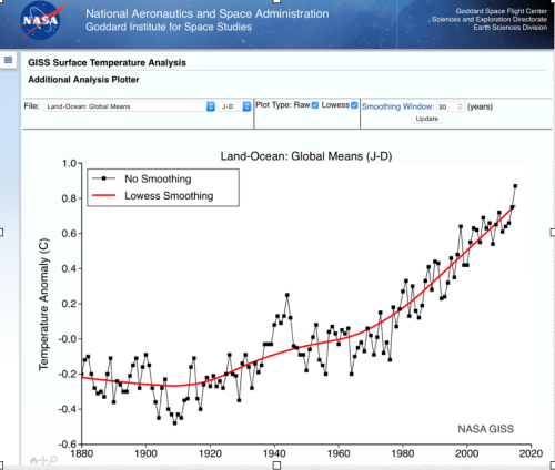
[also see the Met Office explainer on global surface temperature]
The red line shows inexorable warming from early in the 20th Century, no ifs, no buts.
End of argument.
When I challenged a climate scientist on Twitter, why don’t we just show this graph and not get pulled into silly arguments with a Daily Mail journalist or whoever, I was told that annual changes are interesting and need to be understood.
Well sure, for climate scientists everything is interesting! They should absolutely try to answer the detailed questions, such as the contribution global warming made to the 2016 GMST. But to conflate that with the simpler and broader question does rather obscure the fundamental message for the curious but confused public who have not even reached base camp.
They may well conclude there is a ‘debate’ about global warming when there is none to be had.
There is debate amongst scientists about many things: regional impact and attribution; different feedback mechanisms and when they might kick in; models of the Antarctic ice sheet; etc. But not about rising GMST, because that is settled science, and given Tyndall et al, it would be incredible if it were not so; Nobel Prize winning incredible!
If one needs a double knock-out, then how about a triple or quadruple knock-out?
When we add the graphs showing sea level rise, loss of glaciers, mass loss from Greenland and Antarctica, and upper ocean temperature, we have multiple trend lines all pointing in one direction: A warming world. It ain’t rocket science.
We know the world has warmed – it is unequivocal.
Now if a the proverbial drunk, duly floored, still decides to get up and wants to rerun the fight, maybe we should be choosing not to play his games!?
So why do arguments about annual variability get so frequently aired on the blogosphere and twitter?
I don’t know, but I feel it is a massive own goal for science communication.
Surely the choice of audience needs to be the poor dazed and confused ‘person in the street’, not the obdurately ignorant opinion columnists (opinion being the operative word).
Why worry about a 1oC rise?
I want to address the question “Why worry about a 1oC rise (in global mean surface temperature)?”, and do so with the help of a dialogue. It is not a transcript, but along the lines of conversations I have had in the last year. In this dialogue, I am the ClimateCoach and I am in conversation with a Neighbour who is curious about climate change, but admits to being rather overwhelmed by it; they have got as far as reading the material above and accept that the world is warming.
Neighbour: Ok, so the world is warming, but I still don’t get why we should worry about a measly 1oC warming?
ClimateCoach: That’s an average, over the whole world, and there are big variations hidden in there. Firstly, two thirds of the surface of the planet is ocean, and so over land we are already talking about a global land mean surface temperature in excess of 1oC, about 1.5oC. That’s the first unwelcome news, the first kicker.
Neighbour: So, even if it is 5oC somewhere, I still don’t get it. Living in England I’d quite like a few more Mediterranean summers!
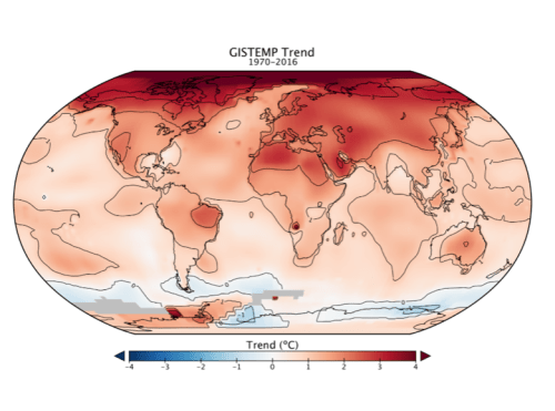
ClimateCoach: Ok, so let’s break this down (and I may just need to use some pictures). Firstly we have an increase in the mean, globally. But due to meteorological patterns there will be variations in temperature and also changes in precipitation patterns around the world, such as droughts in California and increased Monsoon rain in India. This regionality of the warming is the second kicker.
Here is an illustration of how the temperature increase looks regionally across the world.
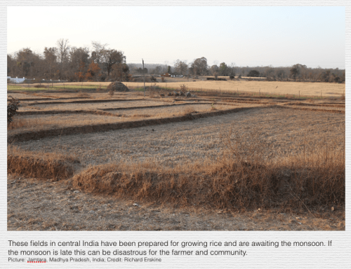
Neighbour: Isn’t more rain good for Indian farmers?
ClimateCoach: Well, that depends on timing. It has started to be late, and if it doesn’t arrive in time for certain crops, that has serious impacts. So the date or timing of impacts is the third kicker.
Here is an illustration.
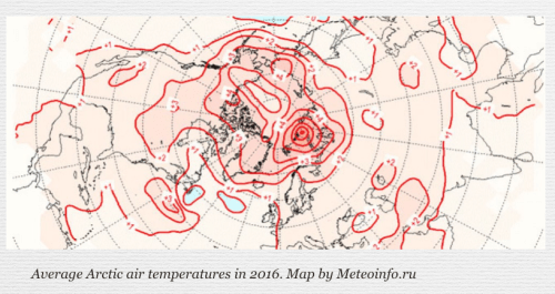
Neighbour: I noticed earlier that the Arctic is warming the most. Is that a threat to us?
ClimateCoach: Depends what you mean by ‘us’. There is proportionally much greater warming in the Arctic, due to a long-predicted effect called ‘polar amplification’, in places as much as 10oC of warming. As shown in this map of the arctic. But what happens in the Arctic doesn’t stay in the Arctic.
Neighbour: I appreciate that a warming Arctic is bad for ecosystems in the Arctic – Polar Bears and so on – but why will that effect us?
ClimateCoach: You’ve heard about the jet stream on the weather reports, I am sure [strictly, the arctic polar jet stream]. Well, as the Arctic is warmed differentially compared to latitudes below the Arctic, this causes the jet stream to become more wiggly than before, which can be very disruptive. This can create, for example, fixed highs over Europe, and very hot summers.
Neighbour: But we’ve had very hot summers before, why would this be different?
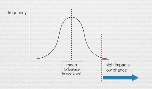
ClimateCoach: It’s not about something qualitatively different (yet), but it is quantitatively. Very hot summers in Europe are now much more likely due to global warming, and that has real impacts. 70,000 people died in Europe during the 2003 heatwave. Let me show you an illustrative graph. Here is a simple distribution curve and it indicates a temperature at and above which (blue arrow) high impacts are expected, but have a low chance. Suppose this represents the situation in 1850.
Neighbour: Ok, so I understand the illustration … and?
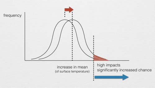
ClimateCoach: So, look at what happens when we increase the average by just a little bit to a higher temperature, say, by 1oC to represent where we are today. The whole curve shifts right. The ‘onset of high impact’ temperature is fixed, but the area under the curve to the right of this has increased (the red area has increased), meaning a greater chance than before. This is the fourth kicker.
In our real world example, a region like Europe, the chance of high impact hot summers has increased within only 10 to 15 years from being a one in 50 year event to being a 1 in 5 year event; a truly remarkable increase in risk; which is actually understandable from basic statistical reasoning.
Neighbour: It’s like loading the dice!
ClimateCoach: Exactly. We (humans) are loading the dice. As we add more CO2 to the atmosphere, we load the dice even more.
Neighbour: Even so, we have learned to cope with very hot summers, haven’t we? If not, we can adapt, surely?
ClimateCoach: To an extent yes, and we’ll have to get better at it in the future. But consider plants and animals, or people who are vulnerable or have to work outside, like the millions of those from the Indian sub-continent who work in construction in the Middle East. It doesn’t take much (average) warming to make it impossible (for increasingly long periods) to work outside without heat exhaustion. And take plants. A recent paper in Nature Communications showed that crop yields in the USA would be very vulnerable to excessive heat.
Neighbour: Can’t the farmers adapt by having advanced irrigation systems. And didn’t I read somewhere that extra CO2 acts like a fertiliser for plants?
ClimateCoach: To a point, but what that research paper showed was that the warming effect wins out, especially as the period of excessive heat increases, and by the way the fertilisation effect has been overstated. The extended duration of the warming will overwhelm these and other ameliorating factors. This is the fifth kicker.
This can mean crop failures and hence impacts on prices of basic food commodities, even shortages as impacts increase over time.
Neighbour: And what if we get to 2oC? (meaning 2oC GMST rise above pre-industrial)
ClimateCoach: Changes are not linear. Take the analogy of car speed and pedestrian fatalities. After 20 miles per hour the curve rises sharply, because the car’s energy is a function of the square of the speed, but also the vulnerability thresholds in the human frame. Global warming will cross thresholds for both natural and human systems, which have been in balance for a long time, so extremes get increasingly disruptive. Take an impact to a natural species or habitat: one very bad year, and there may be recovery in the following 5-10 years, which is ok if the frequency of very bad years is 1 in 25-50 years. But suppose very bad years come 1 in every 5 years? That would mean no time to recover. Nature is awash with non-linearities and thresholds like this.
Neighbour: Is that what is happening with the Great Barrier Reef – I heard something fleetingly on BBC Newsnight the other night?
ClimateCoach: I think that could be a very good example of what I mean. We should talk again soon. Bring friends. If they want some background, you might ask them to have a read of my piece Demystifying Global Warming & Its Implications, which is along the lines of a talk I give.
Putting it together for the person in the street.
I have explored one of many possible conversations I could have had. I am sure it could be improved upon, but I hope it illustrates the approach. We should be engaging those people (the majority of the population) who are curious about climate change but have not involved themselves so far, perhaps because they feel a little intimidated by the subject.
When they do ask for help, the first thing they need to understand is that indeed global warming is real, and is demonstrated by those average measures like GMST, and the other ones mentioned such as sea-level rise, ice sheet mass loss, and ocean temperature; not to mention the literally thousands of indicators from the natural world (as documented in the IPCC 5th Assessment Report).
There are also other long-term unusual sources of evidence to add to this list, as Dr Ed Hawkins has discussed, such as the date at which Cherry blossom flowers in Kyoto, which is trending earlier and earlier. Actually, examples such as these, are in many ways easier for people to relate to.
Gardeners the world over can relate to evidence of cherry blossom, wine growers to impacts on wine growing regions in France, etc. These diverse and rich examples are in many ways the most powerful for a lay audience.
The numerous lines of evidence are overwhelming.
So averages are crucial, because they demonstrate a long-term trend.
When we do raise GMST, make sure you show the right curve. If it is to show unequivocal global warming at the surface, then why not show one that reflects the average over a rolling 30 year period; the ‘smoothed’ curve. This avoids getting into debates with ‘contrarians’ on the minutae of annual variations, which can come across as both abstract and arcane, and puts people off.
This answers the first question people will be asking, simply: “Is the world warming?”. The short answer is “Unequivocally, yes it is”. And that is what the IPCC 5th Assessment Report concluded.
But averages are not the whole story.
There is the second but equally important question “Why worry about a 1oC rise (in global mean surface temperature)?”
I suspect many people are too coy to ask such a simple question. I think it deserves an answer and the dialogue above tried to provide one.
Here and now, people and ecosystems experience weather, not climate change, and when it is an extreme event, the impacts are viscerally real in time and place, and are far from being apparently arcane debating points.
So while a GMST rise of 1oC sounds like nothing to the untutored reader, when translated into extreme weather events, it can be highly significant. The average has been magnified to yield a significant effect, as evidenced by the increasing chance of extreme events of different kinds, in different localities, which can increasingly be attributed to man-made global warming.
The kickers highlighted in the dialogue were:
- Firstly, people live on land so experience a higher ‘GMST’ rise (this is not to discount the impacts on oceans);
- Secondly, geographical and meteorological patterns mean that there are a wide range of regional variations;
- Thirdly, the timing (or date) at which an impact is felt is critical for ecosystems and agriculture, and bad timing will magnify the effect greatly;
- Fourthly, as the average increases, so does the chance of extremes. The dice are getting loaded, and as we increase CO2, we load the dice more.
- Fifthly, the duration of an extreme event will overwhelm defences, and an extended duration can cross dangerous thresholds, moving from increasing harm into fatal impacts, such as crop failure.
I have put together a graphic to try to illustrate this sequence of kickers:
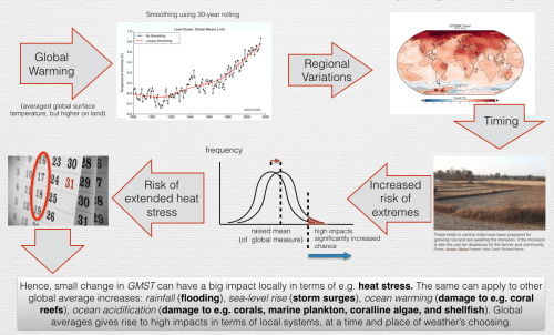
As noted on this graphic (which I used in some climate literacy workshops I ran recently), the same logic used for GMST can be applied to other seemingly ‘small’ changes in global averages such as rainfall, sea-level rise, ocean temperature and ocean acidification. To highlight just two of these other examples:
- an average global sea-level rise translates into impacts such as extreme storm surges, damaging low-lying cities such as New York and Miami (as recently reported and discussed).
- an average ocean temperature rise, translates into damage to coral reefs (two successive years of extreme events have caused serious damage to two thirds of the Great Barrier Reef, as a recent study has confirmed).
Even in the relatively benign context of the UK’s temperate climate, the Royal Horticultural Society (RHS), in a report just released, is advising gardeners on climate change impacts and adaptation. The instinctively conservative ‘middle England’ may yet wake up to the realities of climate change when it comes home to roost, and bodies such as the RHS reminds them of the reasons why.
The impacts of man-made global warming are already with us, and it will only get worse.
How much worse depends on all of us.
Not such a stupid question
There was a very interesting event hosted by CSaP (Centre for Science and Policy) in Cambridge recently. It introduced some new work being done to bring together climate science and ‘big data analytics’. Dr Emily Schuckburgh’s talk looked precisely at the challenge of understanding local risks; the report of the talk included the following observation:
“Climate models can predict the impacts of climate change on global systems but they are not suitable for local systems. The data may have systematic biases and different models produce slightly different projections which sometimes differ from observed data. A significant element of uncertainty with these predictions is that they are based on our future reduction of emissions; the extent to which is yet unknown.
To better understand present and future climate risks we need to account for high impact but low probability events. Using more risk-based approaches which look at extremes and changes in certain climate thresholds may tell us how climate change will affect whole systems rather than individual climate variables and therefore, aid in decision making. Example studies using these methods have looked at the need for air conditioning in Cairo to cope with summer heatwaves and the subsequent impact on the Egyptian power network.”
This seems to be breaking new ground.
So maybe the eponimous ‘person in the street’ is right to ask stupid questions, because they turn out not to be so stupid after all.
Changing the Conversation
I assume that the person in the street is curious and has lots of questions; and I certainly don’t judge them based on what newspaper they read. That is my experience. We must try to anticipate and answer those questions, and as far as possible, face to face. We must expect simple questions, which aren’t so stupid after all.
We need to change the focus from the so-called ‘deniers’ or ‘contrarians’ – who soak up so much effort and time from hard pressed scientists – and devote more effort to informing the general public, by going back to the basics. By which I mean, not explaining ‘radiative transfer’ and using technical terms like ‘forcing’, ‘anomaly’, or ‘error’, but using plain English to answer those simple questions.
Those embarrasingly stupid questions that will occur to anyone who first encounters the subject of man-made global warming; the ones that don’t seem to get asked and so never get answered.
Maybe let’s start by going beyond averages.
No one will think you small for doing so, not even a Dutchman.
[updated 15th April]

Thoughtful, clear and informative post. Thanks for sharing.
LikeLike