
The IPCC (Intergovernmental Panel on Climate Change) is exploring ways to improve the communication of its findings, particularly to a more general audience. They are not alone in having identified a need to think again about clear ‘science communications’. For example, the EU’s HELIX project (High-End Climate Impacts and Extremes), produced some guidelines a while ago on better use of language and diagrams.
Coming out of the HELIX project, and through a series of workshops, a collaboration with the Tyndall Centre and Climate Outreach, has produced a comprehensive guide (Guide With Practical Exercises to Train Researchers In the Science of Climate Change Communication)
The idea is not to say ‘communicate like THIS’ but more to share good practice amongst scientists and to ensure all scientists are aware of the communication issues, and then to address them.
Much of this guidance concerns the ‘soft’ aspects of communication: how the communicator views themself; understanding the audience; building trust; coping with uncertainty; etc.
Some of this reflects ideas that are useful not just to scientific communication, but almost any technical presentation in any sector, but that does not diminish its importance.
This has now been distilled into a Communications Handbook for IPCC Scientists; not an official publication of the IPCC but a contribution to the conversation on how to improve communications.
I want to take a slightly different tack, which is not a response to the handbook per se, but covers a complementary issue.
In many years of being involved in presenting complex material (in my case, in enterprise information management) to audiences unfamiliar with the subject at hand, I have often been aware of the communication potential but also risks of diagrams. They say that a picture is worth a thousand words, but this is not true if you need a thousand words to explain the picture!
The unwritten rules related to the visual syntax and semantics of diagrams is a fascinating topic, and one which many – and most notably Edward Tufte – have explored. In chapter 2 of his insightful and beautiful book Visual Explanations, Tufte argues:
“When we reason about quantityative evidence, certain methods for displaying and analysing data are better than others. Superior methods are more likely to produce truthful, credible, and precise findings. The difference between an excellent analysis and a faulty one can sometimes have momentous consequences”
He then describes how data can be used and abused. He illustrates this with two examples: the 1854 Cholera epidemic in London and the 1986 Challenger space shuttle disaster.
Tufte has been highly critical of the over reliance on Powerpoint for technical reporting (not just presentations) in NASA, because the form of the content degrades the narrative that should have been an essential part of any report (with or without pictures). Bulletized data can destroy context, clarity and meaning.
There could be no more ‘momentous consequences’ than those that arise from man-made global warming, and therefore, there could hardly be a more important case where a Tuftian eye, if I may call it that, needs to be brought to bear on how the information is described and visualised.
The IPCC, and the underlying science on which it relies, is arguably the greatest scientific collaboration ever undertaken, and rightly recognised with a Nobel Prize. It includes a level of interdisciplinary cooperation that is frankly awe-inspiring; unique in its scope and depth.
It is not surprising therefore that it has led to very large and dense reports, covering the many areas that are unavoidably involved: the cryosphere, sea-level rise, crops, extreme weather, species migration, etc.. It might seem difficult to condense this material without loss of important information. For example, Volume 1 of the IPCC Fifth Assessment Report, which covered the Physical Basis of Climate Change, was over 1500 pages long.
Nevertheless, the IPCC endeavours to help policy-makers by providing them with summaries and also a synthesis report, to provide the essential underlying knowledge that policy-makers need to inform their discussions on actions in response to the science.
However, in its summary reports the IPCC will often reuse key diagrams, taken from the full reports. There are good reasons for this, because the IPCC is trying to maintain mutual consistency between different products covering the same findings at different levels of detail.
This exercise is fraught with risks of over-simplification or misrepresentation of the main report’s findings, and this might limit the degree to which the IPCC can become ‘creative’ with compelling visuals that ‘simplify’ the original diagrams. Remember too that these reports need to be agreed by reviewers from national representatives, and the language will often seem to combine the cautiousness of a scientist with the dryness of a lawyer.
So yes, it can be problematic to use artistic flair to improve the comprehensibility of the findings, but risk losing the nuance and caution that is a hallmark of science. The countervailing risk is that people do not really ‘get it’; and do not appreciate what they are seeing.
We have seen with the Challenger reports, that people did not appreciate the issue with the O rings, especially when key facts were buried in 5 levels of indented bullet points in a tiny font, for example or, hidden in plain sight, in a figure so complex that the key findings are lost in a fog of complexity.
That is why any attempt to improve the summaries for policy makers and the general public must continue to involve those who are responsible for the overall integrity and consistency of the different products, not simply hived off to a separate group of ‘creatives’ who would lack knowledge and insight of the nuance that needs to be respected. But those complementary skills – data visualizers, graphics artists, and others – need to be included in this effort to improve science communications. There is also a need for those able to critically evaluate the pedagogic value of the output (along the lines of Tufte), to ensure they really inform, and do not confuse.
Some individuals have taken to social media to present their own examples of how to present information, which often employs animation (something that is clearly not possible for the printed page, or its digital analogue, a PDF document). Perhaps the most well known example to date was Professor Ed Hawkin’s spiral picture showing the increase in global mean surface temperature:
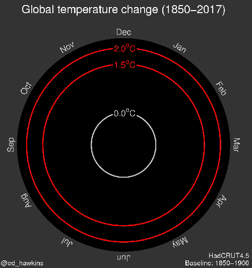
This animation went viral, and was even featured as part of the Rio Olympics Opening Ceremony. This and other spiral animations can be found at the Climate Lab Book site.
There are now a number of other great producers of animations. Here follows a few examples.
Here, Kevin Pluck (@kevpluck) illustrates the link between the rising carbon dioxide levels and the rising mean surface temperature, since 1958 (the year when direct and continuous measurements of carbon dioxide were pioneered by Keeling)
Kevin Pluck has many other animations which are informative, particularly in relation to sea ice.
Another example, from Antti Lipponen (@anttilip), visualises the increase in surface warming from 1900 to 2017, by country, grouped according to continent. We see the increasing length/redness of the radial bars, showing an overall warming trend, but at different rates according to region and country.
A final example along the same lines is from John Kennedy (@micefearboggis), which is slightly more elaborate but rich in interesting information. It shows temperature changes over the years, at different latitudes, for both ocean (left side) and land (right side). The longer/redder the bar the higher the increase in temperature at that location, relative to the temperature baseline at that location (which scientists call the ‘anomaly’). This is why we see the greatest warming in the Arctic, as it is warming proportionally faster than the rest of the planet; this is one of the big takeaways from this animation.
These examples of animation are clearly not dumbing down the data, far from it. They improve the chances of the general public engaging with the data. This kind of animation of the data provides an entry point for those wanting to learn more. They can then move onto a narrative treatment, placing the animation in context, confident that they have grasped the essential information.
If the IPCC restricts itself to static media (i.e. PDF files), it will miss many opportunities to enliven the data in the ways illustrated above that reveal the essential knowledge that needs to be communicated.
(c) Richard W. Erskine, 2018

I am afraid better communication will NOT help. People simply dont care. Now what?
LikeLiked by 1 person
That may be your experience but I disagree. It is too black and white to say “people simply don’t care”. Surveys suggest there is a great deal of concern. The challenge is getting meaningful action to address that concern, and recognise the scale of the change required.
LikeLike
Pingback: Communicating Key Figures from IPCC Reports to a Wider Public | EssaysConcerning