
If you were to think about ranking the most important Figures from the IPCC Fifth Assessment Report, I would not be surprised if the following one (SPM.10) did not emerge as a strong candidate for the number one slot:

This is how the Figure appears in the main report, on page 28 (in the Summary for Policymakers) of The Physical Basis Report (see References: IPCC, 2013). The Synthesis Report includes a similar figure with additional annotations.
Many have used it in talks because of its fundamental importance (for example, Sir David King in his Walker Institute Annual Lecture (10th June 2015), ahead of COP21 in Paris). I have followed this lead, and am sure that I am not alone.
This Figure shows an approximately linear1 relationship between the cumulative carbon dioxide we emit2, and the rise in global average surface temperature3 up to 2100. It was crucial to discussions on carbon budgets held in Paris and the goal of stabilising the climate.
I am not proposing animating this Figure in the way discussed in my previous essay, but I do think its importance warrants additional attention to get it out there to a wider audience (beyond the usual climate geeks!).
So my question is:
“Does it warrant some kind of pedagogic treatment for a general audience (and dare I say, for policy-makers who may themselves struggle with the density of information conveyed)?”
My answer is yes, and I believe that the IPCC, as guardians of the integrity of the report findings, are best placed to lead such an effort, albeit supported by skills to support the science communications.
The IPCC should not leave it to bloggers and other commentators to furnish such content, as key Figures such as this are fundamental to the report’s findings, and need to be as widely understood as possible.
While I am conscious of Tufte’s wariness regarding Powerpoint, I think that the ‘build’ technique – when used well – can be extremely useful in unfolding the information, in biteable chunks. This is what I have tried to do with the above Figure in a recent talk. I thought I would share my draft attempt.
It can obviously do with more work, and the annotations represent my emphasis and use of language4. Nevertheless, I believe I was able to truthfully convey the key information from the original IPCC Figure more successfully than I have before; taking the audience with me, rather than scaring them off.
So here goes, taken from a segment of my talk … my narrative, to accompany the ‘builds’, is in italics …
Where are we now?
“There is a key question: what is the relationship between the peak atmospheric concentration and the level of warming, compared to a late 19th century baseline, that will result, by the end of the 21st century?”
“Let’s start with seeing where we are now, which is marked by a X in the Figure below.”

“Our cumulative man-made emissions of carbon dioxide (CO2) have to date been nearly 2000 billion tonnes (top scale above)”
“After noting that 50% of this remains in the atmosphere, this has given rise to an increase in the atmospheric concentration from its long-standing pre-industrial value of 280 parts per million to it current value which is now about 400 parts per million (bottom scale above).”
“This in turn has led to an increase in averaged global surface temperature of 1oC above the baseline of 1861 to 1880 (vertical scale above).”
Where might we be in 2100?
“As we add additional carbon dioxide, the temperature will rise broadly in proportion to the increased concentration in the atmosphere. There is some uncertainty between “best case” and “worst case” margins of error (shown by the dashed lines).”

“By the end of the century, depending on how much we emit and allowing for uncertainties, we can end up anywhere within the grey area shown here. The question marks (“?”) illustrate where we might be by 2100.”
Can we stay below 2C?
“The most optimistic scenario included in the IPCC’s Fifth Assessment Report (AR5) was based on the assumption of a rapid reduction in emissions, and a growing role for the artificial capture of carbon dioxide from the atmosphere (using a technology called BECCS).”
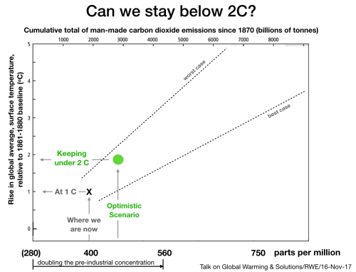
“This optimistic scenario would meet the target agreed by the nations in Paris, which is to limit the temperature rise to 2oC.”
“We effectively have a ‘carbon budget’; an amount of fossil fuels that can be burned and for us to stay below 2oC”.
“The longer we delay dramatically reducing emissions, the faster the drop would need to be in our emissions later, as we approach the end of the ‘carbon budget’.”
“Some argue that we are already beyond the point where we can realistically move fast enough to make this transition.”
“Generally, experts agree it is extremely challenging, but still not impossible.”
Where will we be in 2100? – Paris Commitments
“The nationally determined contributions (or NDCs) – the amounts by which carbon dioxide emissions will fall – that the parties to the Paris Agreement put forward have been totted up and they would, if implemented fully, bring us to a temperature rise of between 2.5 and 3.5 oC (and an atmospheric concentration about twice that of pre-industrial levels).”
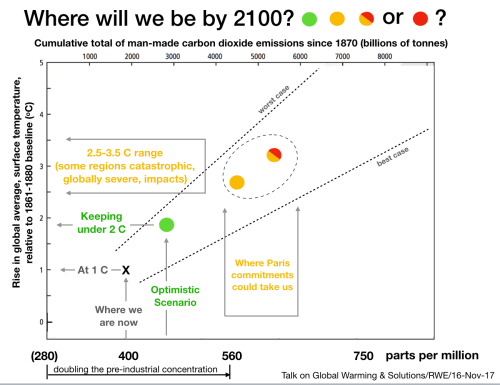
“Now, the nations are committed to increase their ‘ambition’, so we expect that NDCs should get better, but it is deeply concerning that at present, the nations’ current targets are (1) not keeping us unambiguously clear of catastrophe, and (2) struggling to be met. More ambition, and crucially more achievement, is urgent.”
“I have indicated the orange scenarios as “globally severe”, but for many regions “catastrophic” (but some, for example, Xu and Ramanathan5, would use the term “Catastrophic” for any warming over 3oC, and “Unknown” for warming above 5oC). The IPCC are much more conservative in the language they use.”
Where will we be in 2100? – Business As Usual Scenario
“The so-called ‘business as usual’ scenario represents on-going use of fossil fuels, continuing to meet the majority of our energy needs, in a world with an increasing population and increasing GDP per capita, and consequently a continuing growth in CO2 emissions.”

”This takes global warming to an exceptionally bad place, with a (globally averaged) temperature rise of between 4 and 6 oC; where atmospheric concentrations will have risen to between 2.5 and 3 times the pre-industrial levels.”
“The red indicates that this is globally catastrophic.”
“If we go above 5oC warming we move, according to Xu and Ramanathan, from a “catastrophic” regime to an “unknown” one. I have not tried to indicate this extended vocabulary on the diagram, but what is clear is that the ‘business as usual’ scenario is really not an option, if we are paying attention to what the science is telling us.”
That’s it. My draft attempt to convey the substance and importance of Figure SPM.10, which I have tried to do faithfully; albeit adding the adjectives “optimistic” etc. to characterise the scenarios.
I am sure the IPCC could do a much better job than me at providing a more accessible presentation of Figure SPM.10 and indeed, a number of high ranking Figures from their reports, that deserve and need a broader audience.
© Richard W. Erskine
Footnotes
- The linearity of this relationship was originally discussed in Myles Allen et al (2009), and this and other work has been incorporated in the IPCC reports. Also see Technical Note A below.
- About half of which remains in the atmosphere, for a very long time
- Eventually, after the planet reaches a new equilibrium, a long time in the future. Also see Technical Note B below.
- There are different opinions are what language to use – ‘dangerous’, ‘catastrophic’, etc. – and at what levels of warming to apply this language. The IPCC is conservative in its use of language, as is customary in the scientific literature. Some would argue that in wanting to avoid the charge of being alarmist, it is in danger of obscuring the seriousness of the risks faced. In my graphics I have tried to remain reasonably conservative in the use of language, because I believe things are serious enough; even when a conservative approach is taken.
In a recent paper in the Proceedings of the National Academy of Sciences, two climate scientists—Yangyang Xu, of Texas A. & M., and Veerabhadran Ramanathan, of the Scripps Institution of Oceanography—proposed that warming greater than three degrees Celsius be designated as “catastrophic” and warming greater than five degrees as “unknown??” The “unknown??” designation, they wrote, comes “with the understanding that changes of this magnitude, not experienced in the last 20+ million years, pose existential threats to a majority of the population.”
References
- IPCC, 2013: Climate Change 2013: The Physical Science Basis. Contribution of Working Group I to the Fifth Assessment Report of the Intergovern- mental Panel on Climate Change [Stocker, T.F., D. Qin, G.-K. Plattner, M. Tignor, S.K. Allen, J. Boschung, A. Nauels, Y. Xia, V. Bex and P.M. Midgley (eds.)]. Cambridge University Press, Cambridge, United Kingdom and New York, NY, USA, 1535 pp.
- IPCC, 2001: Climate Change 2001: The Scientific Basis. Contribution of Working Group I to the Third Assessment Report of the Intergovernmental Panel on Climate Change [Houghton, J.T., Y. Ding, D.J. Griggs, M. Noguer, P.J. van der Linden, X. Dai, K. Maskell, and C.A. Johnson (eds.)]. Cambridge University Press, Cambridge, United Kingdom and New York, NY, USA, 881pp.
- Myles Allen at al (2009), “Warming caused by cumulative carbon emissions towards the trillionth tonne”,Nature 458, 1163-1166
- Kirsten Zickfeld et al (2016), “On the proportionality between global temperature change and cumulative CO2 emissions during periods of net negative CO2 emissions”, Environ. Res. Lett. 11 055006
Technical Notes
A. Logarithmic relationship?
For those who know about the logarithmic relationship between added CO2 concentration and the ‘radiative forcing’ (giving rise to warming) – and many well meaning contrarians seem to take succour from this fact – the linear relationship in this figure may at first sight seem surprising.
The reason for the linearity is nicely explained by Marcin Popkiewicz in his piece “If growth of CO2 concentration causes only logarithmic temperature increase – why worry?”
The relative warming (between one level of emissions and another) is related to the ratio of this logarithmic function, and that is approximately linear over the concentration range of interest.
In any case, it is worth noting that CO2 concentrations have been increasing exponentially, and a logarithm of an exponential function is a linear function.
There is on-going work on wider questions. For example, to what extent ‘negative emissions technology’ can counteract warming that is in the pipeline?
Kirsten Zickfield et al (2016), is one such paper, “…[suggests that] positive CO2 emissions are more effective at warming than negative emissions are at subsequently cooling”. So we need to be very careful in assuming we can reverse warming that is in the pipeline.
B. Transient Climate Response and Additional Warming Commitment
The ‘Transient Climate Response’ (TCR) reflects the warming that results when CO2 is added at 1% per year, which for a doubling of the concentration takes 70 years. This is illustrated quite well in a figure from a previous report (Reference: IPCC, 2001):

The warming that results from this additional concentration of CO2 occurs over the same time frame. However, this does not include all the the warming that will eventually result because the earth system (principally the oceans and atmosphere) will take a long time to reach a new equilibrium where all the flows of energy are brought back into a (new) balance. This will take at least 200 years (for lower emission scenarios) or much longer for higher emission levels. This additional warming commitment must be added to the TCR. However, the TCR nevertheless does represent perhaps 70% of the overall warming, and remains a useful measure when discussing policy options over the 21st Century.
This discussion excludes more uncertain and much longer term feedbacks involving, for example, changes to the polar ice sheets (and consequentially, the Earth’s albedo), release of methane from northern latitudes or methane clathrates from the oceans. These are not part of the ‘additional warming commitment’, even in the IPCC 2013 report, as they are considered too speculative and uncertain to be quantified.
. . o O o . .
