
This essay is based on an extract from a talk I did recently that was well received. This specific part of the talk was described as very helpful in clarifying matters related to our carbon dioxide emissions. I hope others also find it useful.
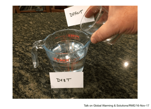
David Cameron said on 24 January 2013 “We’re paying down Britain’s debts” and got a lot of stick for this misleading statement. Why? Let me try to explain.
The deficit is the annual amount by which we spend more than we get in taxes. Whereas, the debt is the cumulative sum of year on year deficits.
As many politicians do, Cameron was using language designed to be, shall we say, ‘economical with the truth’. He was not the first, and he won’t be the last.
We can picture deficit being added to our debt using the following picture (or for greater dramatic effect, do it live if you are giving a talk):
If the deficit declines this year compared to last year, that may be of great solace to the Chancellor (and that was the situation in 2013), because maybe it’s the start of a trend that will mean that the debt may reach a peak.
Cameron could have said “Our debt keeps rising, but at least the rate at which it is rising is slightly less than last year. We’ll need to borrow some more to cover the additional deficit”, would the a honest statement, but he didn’t. It simply wouldn’t have cut it with the spin doctors.
The reality is that the only thing we can conclude from a deficit this year that is smaller than last year is that that the debt has increased by an amount less than last year. That’s it. It doesn’t sound quite so great put that way, does it?
You need year-on-year surpluses to actually bring the debt down.
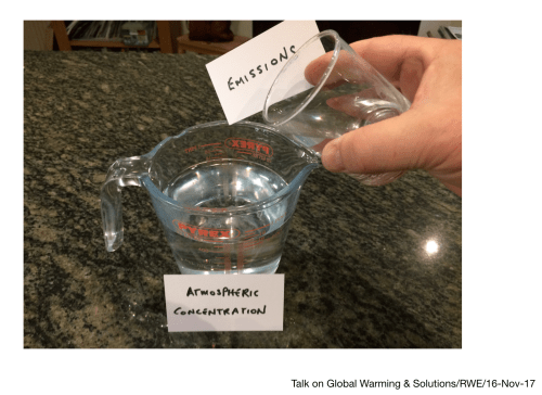
Deficit and debt are useful in making an analogy with carbon dioxide in the atmosphere, because the confusion – intended or accidental – over deficit and debt, is very similar to the confusion that occurs in the mind of the public when the media report changes in our carbon emissions.
Let’s explore the analogy by replacing “Deficit” with “Emissions”, and “Debt” with “Atmospheric Concentration” …
The annual emissions add to the cumulative emissions in the atmosphere, i.e. the raised Atmospheric Concentration.
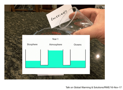
There are two differences with the financial analogy when we think about carbon dioxide in the atmosphere.
Firstly, when we add, say, 40 billion tonnes of carbon dioxide to the atmosphere (the green coloured area represents the added carbon dioxide) …
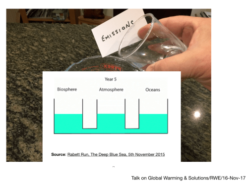
… then, within a short time (about 5 years) 50% of the added carbon dioxide (that is 20 billion tonnes, in this illustration), is absorbed in oceans and biosphere, balancing the remainder of carbon dioxide added to atmosphere, and we can visualize this balance as follows (Credit: Rabett Run, which includes a more technical description and an animation) –
Secondly, unlike with the economy, once the atmospheric concentration of carbon dioxide goes up, it stays up for hundred of years (and to get back to where it started, thousands of years), because for one thing, the processes to take carbon from the upper ocean to the deep ocean are very slow.
Unlike with the economy, our added carbon dioxide concentration in the atmosphere always goes in the wrong direction; it increases.
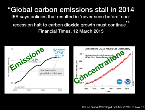
So when we see stories that talk about “emissions stalling” or other phrases that seem to offer reassurance, remember, they are talking about emissions (deficit) NOT concentrations (debt).
The story title below is just one example, taken from the Financial Times ( and I am not picking on the FT, but it shows that this is not restricted to the tabloids).
Whenever we see a graph of emissions over the years (graph on the left), the Health Warning should always be the Keeling Curve (graph on the right).
So the global garbon dioxide emissions in 2014 and 2015 where 36.08 and 36.02 billion tonnes, respectively. Cause for cautious rejoicing? Well, given the huge number of variables that go into this figure (the GDP of each nation; their carbon intensity; the efficiency level for equipment and transport; and so on), projecting a trend from a few years is a tricky business, and some have devoted their lives to tracking this figure. Important work for sure.
Then 2016 came along and the figure was similar but slightly raised, at 36.18 billion tonnes.
But we were said to be stalled … 36.08, 36.02 and 36.18.
I liken this to heading for the cliff edge at a steady pace, but at least no longer accelerating. Apparently that is meant to be reassuring.
Then comes the projected figure for 2017, which includes a bit of a burp of carbon dioxide from the oceans – courtesy of the strong El Nino – and this was even predicted, and horror of horrors, it makes headline news around the world.
We have jumped by 2% over the previous year (actually 1.7% to 36.79 billion tonnes). Has the ‘stall’ now unstalled? What next?
The real headline is that we are continuing to emit over 35 billion tonnes of carbon dioxide, year on year without any sign of stopping.
Only when emissions go down to 0 (zero), will the atmospheric concentration STOP rising.
So in relation to our emissions what word do we want to describe it? Not stall, not plateau, not ease back, but instead, stop, finito or end. They’ll do.
I have discovered – from talking to people who do not follow climate change on twitter, or the blogosphere, and are not fans of complex data analysis – that what I explained above was very helpful but also not widely appreciated.
But in a sense, this is probably the most important fact about climate change that everyone needs to understand, that
the carbon dioxide concentration will only stop rising when emissions completely stop.
The second most important fact is this:
whatever value the atmospheric concentration of carbon dioxide gets to – at that point in the future when we stop adding more – that it is where it will stay for my grandchild, and her grandchildren, and their grandchildren, and so on … for centuries* to come.
The Keeling Curve – which measures the global atmospheric concentration of carbon dioxide – is the only curve that matters, because until it flattens, we will not know how much warming there will actually be, because of the third most important fact people must understand is this:
broadly speaking, the level of warming is proportional to the the peak concentration of carbon dioxide.
So when we see stories that talk about “emissions stalling” or other phrases that seem to offer hope that we’ve turned a corner, remember, they are talking about emissions (deficit) NOT concentrations (debt).
It is amazing how often the deficit/ debt confusion is played on by policitians regarding the nations finances.
The ’emissions stalling’ narrative of the last few years has led many to imagine we are, if not out of the woods, then on our way, but I think the confusion here is a failure of the media and other science communicators to always provide a clear health warning.
The truth is that we, as a species, are a long way still from showing a concerted effort to get out of the woods. Worse still, we are arguing amongst ourselves about which path to take.
(c) Richard W. Erskine, 2017
[* Unless and until we find a way to artificially extract and sequester carbon dioxide; this is still only R&D and not proven at scale yet, so does not rescue the situation we face in the period leading to 2050. We need to halt emissions, not just “stall” them.]
#carbondioxide #emissions #debt #deficit
