I love the BBC series ‘In Our Time’ (IOT), conceived by Melvyn Bragg (MB) and hosted by him for over 25 years. The more than 1000 episodes have covered innumerable topics in the arts, history, science, philosophy, politics and much more. Typically three Professors, leading experts in a field, are invited to explore the knowledge and scholarship on the topic of the week. Delightful surprises has been its hallmark covering topics as diverse as ‘Tea’, ‘The Neutron’, ‘The Illiad’ and so much more.
The life and work of scientists have been covered many times: Robert Hooke, Dorothy Hodgkin and Paul Dirac being a few examples. You might think that the most pressing topic of our age – man-made climate change – might get quite a bit of attention, but it doesn’t. It’s not as if its too contemporary for IOT’s tastes; unsuitable for the historical lens that IOT likes to employ. The science of climate change dates back at least 200 years.
The lives of five scientists come to mind which could help explore the huge subject of climate change: John Tyndall, Svant Arrhenius, Guy Callendar, Wally Broecker and Michael Mann are just a small sample of ones that come to mind. None of these has been covered by IOT. Here’s why each of these would be great candidates for an episode:
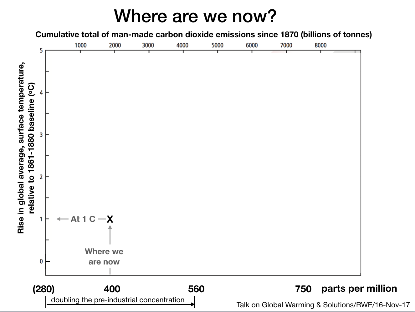
- John Tyndall is regarded as one of the greatest experimentalists of the 19th century, and a great populariser of science. His apparatus – that in the years 1859-1861 demonstrated that carbon dioxide and other gases were heat trapping, but that oxygen and nitrogen were not – can still be seen at The Royal Institution, where he did his experiments. An episode could cover Tyndall or simply be on ‘Greenhouse Gases’ and include a survey of work up to Manabe & Wetheralds seminal 1967 paper.
- Svante Arrhenius, a Nobel Prize-winning scientist, published the first calculation on how much the world would warm if the concentration of carbon dioxide (CO₂) in the atmosphere doubled – in 1896. Again an episode could cover Arrhenius exclusively or deal with the question of ‘Earth Climate Sensitivity’.
- Guy Callendar published a paper in 1938 that was the first to demonstrate empirically the correlation between rising levels of CO₂ in the atmosphere (attributable to human activities) and rising global mean surface temperature. Some have even suggested that instead of referring to ‘The Greenhouse Effect’ we should use the term ‘The Callendar Effect’.
- Wally Broecker was a famous oceanographer who coined the term ‘The Great Ocean Conveyor’, which moves heat around the oceans of the world, and whose understanding is crucial to climate science. He also coined the term ‘Global Warming’. Broecker said that following the publication of Manabe and Wetheralds seminal 1967 paper, man-made climate change stopped being a cocktail conversation amongst scientists, and something that was increasingly concerning.
- Michael Mann et al published the famous ‘Hockey Stick’ paper in 1999 which gathered all the disparate data to demonstrate unequivocally that the world was warming. So powerful in fact that the fossil-fuel funded forces of denial started a vicious campaign to try to discredit Mann. They failed, as the findings have been supported by independent research since.
Needless to say, there are a wealth of women scientists whose work might be considered too recent for IOT, but is often of crucial importance. For example, Friederike Otto’s work on extreme weather attribution has been revolutionary, because now we have the ability to put a number on how much more likely a specific extreme weather event has become as a result of man-made global warming. This can be done in a matter of days rather than the year or more that used to be required for this kind of attribution study (see the World Weather Attribution site for more details). The topic of ‘Extreme weather events’ is assuredly in our time, and increasingly so!
Despite this wealth of knowledge, Climate Change has just once been a topic on the programme, on 6th January 2000 with guests Professor Houghton, who had been a chair of the IPCC, and environmentalist George Monbiot. So no problem, then, it has been covered!
Well, no, because this episode was exceptional in more ways than its rarity.
In every other episode of In Our Time, MB approaches the conversation much like you’d expect of a curious student, trying to learn from the expert professors who he robustly challenges, but respects. The debated points would be ones where experts have engaged in debating a point in the published literature, so disagreements are possible; say, to what extent Rosalind Franklin’s work was key to discovering the structure of DNA. What is not generally entertained on IOT are outlier comments from those who are not experts in the field.
So, the IOT Climate Change episode in 2000 was quite different. Outrageously different. MB approached the conversation not as a curious student, but sounding more like an opinionated journalist with an angle doing an interview, and boy, did he have an angle!
He had a completely different tone to normal, not of respectful enquiry. He reprised talking points that are rife within climate science denial circles, and even cited Matt Ridley (“no slouch”) a well known propagandist – a free-market fundamentalist like his father – who engages in constant attacks on climate science, and the climate solutions he wishes to undermine.
Leo Hickman noted on Twitter (3-1-2015) “Little known fact: Bragg witnessed GWPF’s Companies House docs for Lord Lawson”, so one is bound to speculate whether it was no accident that MB was channeling the GWPF (Global Warming Policy Foundation) non-science.
It’s easier to see what I mean about the episode by listening to the episode but I will use some snippets from the transcript here to illustrate what I mean (MB quotes in italics):
- “With me to discuss what could be called “The new climate of fear” at the beginning of a new century is …”, from the off, it was clear that MB was not interested in obvious questions like “how have we come to an understanding of man-made global warming?”. He clearly wanted to frame it in a way that minimised any discussion of the underlying science. He wanted it to be a ‘both sides’ apparent exchange of newspaper comment pages opinion.
- After George Monbiot’s first contributions, MB chips in “Now this is very much a received view, and you’ve been one of the people that have made it received by banging on, very effectively in the Guardian and in other places, I’m going to challenge this in a minute or two, but I just want to emphasise to the listeners, how apocalyptic your views are, …” – trying to undermine his guest with a charge of alarmism shocked me 24 years ago and shocks me still. The reason it is ‘received’ Melvyn is because of decades of research, thousands of scientific papers, and resulting IPCC (Intergovernmental Panel on Climate Change) reports, not Monbiot’s writings, however lucid they may be.
- MB later pushes harder “Right now, you two have spent….devoted your lives to this subject and I haven’t, but nevertheless, I’ve looked at…tried to find some evidence which contradicts this block view, which seems you’ve got your evidence, but there’s other points of view , and ….’cause I’m worried about the evidence that you can know so much about what’s going to happen in 100 years time, and I’m worried about the lack of robustness …”, but never asks the question ‘please help me understand the evidence’, no he shares what he has read who knows where – in The Spectator perhaps. This might seem normal on a social media comments thread but is pretty unedifying on the normally rather good In Our Time.
- MB says something that is straight from the climate science denial factory at GWPF: “Mmmm, but you…well er…I’m still worried about the evidence for this, the evidence that you….what evidence can you tell us Professor Houghton, that in the next century….’cause all this is to do with man-made pollution isn’t it? That the worry is that this is the Greenhouse Effect, it’s all to do with us emitting too much CO₂, and that sort of thing, can you give us your evidence, for the…why the accumulation of this is going to have such a devastating effect? Because people use extra CO₂ as fertiliser don’t they? To bring crops on?”
The framing, the tone, the references to denialist talking points (such as: ‘carbon dioxide being good for plants therefore must be good to have more of it’, would fail Philosophy 101, let alone the scientific demolition of it).
All of the talking points he raised have been answered innumerable times, if he bothered to do genuine background reading from experts on the subject.
There have been other episodes of IOT that have touched on climate since then, such as the ones on ‘Corals’, ‘Ice Ages’ and others, but clearly both Melvyn Bragg and the production team are staying well clear of man-made climate change after their last diabolical attempt.
What motivates MB’s climate denialism is unclear. It is certainly not independent scholarship. The history of our understanding of climate change has been set out clearly many times, such as in Weart’s book (see Notes). Yet, being a Labour Peer, the free market fundamentalism that drove Lord Lawson and continues to drive much of the funding for climate denial, is unlikely to be the reason. Maybe in some perverse way, it’s his faith that took him there – who knows? The fact is he was very poorly read and badly briefed. It has left a large black hole in an otherwise great series, In Our Time, that is surely crying out to be filled.
No doubt an episode entitled ‘Man-Made Climate Change’, or one based on the life and work of the many scientists that have done so much to reveal our understanding of it, will come back as a topic in due course. There are no shortage of topics linked to it that could also be covered (Fossil fuels, Energy transitions, Extreme weather events, Rossby waves, and many others).
Though I suspect it will not be in Melvyn Bragg’s time.
We’ll have to wait for the sad day when the great man moves on.
(c) Richard Erskine, 2024.
———————— o O o ———————–
Notes
I have not made the essay longer still by including the rebuttals to all the talking points raised by MB, but I don’t need to as others have done a great job addressing commonly shared myths. A good place to go for short non-technical responses is Katharine Hayhoe’s ‘Global Weirding’ series of short videos.
For a slightly longer response to the many myths raised, the site Skeptical Science provides answers in shorter form and longer form. And, specifically, on the argument that more carbon dioxide is good for plants, there is a great rebuttal on the site.
The book by Spencer Weart I mentioned is a great historical survey – starting with scientists like Fourier in the early 19th Century – and is available online: The Discovery of Global Warming.
Of course, the most up to date and rigorous evidence on the causes and impacts of climate change, and on the possible scenarios we may face in the future, is contained in the IPCC (Intergovernmental Panel on Climate Change) reports. The latest full assessment being the 6th Assessment Report.
Getting a reliable sense of what the science is telling us can be hard for non-experts, particularly on shouty social media. I always feel we should go back to the established experts. Some summaries can be useful if they do not try to selectively spin the science in a direction to support a particular framing.
- CarbonBrief do a great job summarising the science such as here: In-depth Q&A: The IPCC’s sixth assessment report on climate science, Carbon Brief, 9th August 2021 https://www.carbonbrief.org/in-depth-qa-the-ipccs-sixth-assessment-report-on-climate-science/
- Intergovernmental Panel on Climate Change (IPCC) is an international body whose work is the product of an international team of scientists from over 60 countries who give their time voluntarily to produce in depth reports. The Sixth Assessment Report (AR6) is the latest full assessment, and covers different aspects: causes, impacts, adaptation and mitigation, both globally but also from a regional perspective. One of the reasons people go to secondary sources is because of the huge size of the IPCC reports. But the IPCC provides summaries. The AR6 report comes in three parts, with summaries as follows:
- Part I: Physical Science Basis Report assesses the causes, and possible future scenarios.An accessible summary is available as a short video: https://youtu.be/e7xW1MfXjLA A written Summary for Policymakers is available here https://www.ipcc.ch/report/ar6/wg1/downloads/report/IPCC_AR6_WGI_SPM.pdf
- Part II: Impacts, Adaptation & Vulnerability Report assesses ecosystems, biodiversity, and human communities at global and regional levels. It also reviews vulnerabilities and the capacities and limits of the natural world and human societies to adapt to climate change.An accessible summary is available as a short video: https://youtu.be/SDRxfuEvqGg A written Summary for Policymakers is available here https://www.ipcc.ch/report/ar6/wg2/downloads/report/IPCC_AR6_WGII_SummaryForPolicymakers.pdf
- Part III: Mitigation of Climate Change Report assesses ways to reduce carbon emissions.An accessible summary is available as a short video: https://youtu.be/7yHcXQoR1zA A written Summary for Policymakers is available here https://www.ipcc.ch/report/ar6/wg3/downloads/report/IPCC_AR6_WGIII_SPM.pdf
If IOT do decide to do a new episode on Climate Change – or more accurately, man-made climate change – they might do well to first re-read Professor Steve Jones’s 2011 report on coverage of climate change at the BBC, and its tendency of using false balance. The report recommended that the BBC coverage “takes into account the non‐contentious nature of some material and the need to avoid giving undue attention to marginal opinion” (download the document then skip to page 14 to get to the report, avoiding the self-justification by BBC senior management prefixing the report itself.)
We can live in hope!
Someone asked about the Ice Ages episode (which I did mention).
This was my response.
Yes, but it only dealt with man-made climate change in the dying few minutes. Richard Corfield, when not talking over the two women scientists with him, was dismissive of the risks. He used an argument that fails Critical Thinking 101, along with Ethics 101, and more.
His gobsmacking words:
“a ‘Greenhouse Climate’ is the natural condition for the Earth. 85% of Earth history has been ‘Greenhouse’ Ummm, 70 million years ago carbon dioxide levels were 8 times what they are at the moment, which made them 2,400 parts per million. Before that they were 12 times higher. The only certainty is that climate change is a natural part of the Earth and as a species we may have been the result of climate change. We may now be altering it but anyhow we’d have to deal with it, so I think we are going to have to geo-engineer our own climate to deal with it. Nothing wrong with that.”
A logically incoherent argument. And it’s not ‘we may now be altering’, we are altering, please read the IPCC reports Richard.
To conflate tens of millions of years with Homo Sapien’s quarter of a million years of existence; or the 12,000 years where civilisation has emerged, in the stable climate we have enjoyed alongside nature since the end of the last ice age; or indeed the 200 years where man-made carbon emissions have increased CO2 levels at an unprecedently fast rate in geological terms, is crass.
The way to stop additional warming is simply to stop burning fossil fuels as soon as possible.
To simply shrug and say that the climate always changes so we’d have to have done something anyway at some point is asinine, and fails to mention that we’d have had 10s of thousands of years to deal with it, not the few decades we now have left to do something, precisely because of naysayers like Melvyn Bragg and Richard Corfield.
No wonder this disaster climate advocate Richard Corfield has been on IOT 8 times.
———————— o O o ———————–